Creating custom charts in Microsoft Excel
- Create and Learn
- Aug 11, 2018
- 2 min read
Updated: Jan 12, 2021
You can use pictures to create custom charts, and help your audience understand your message. Try this easy step-by-step, and download the file with the complete example.

1- Type the information below in Range A1:B9 (all this values are for learning purpose).

2- Go to "Page Layout"' tab, "Sheet Options" and deselect Grid lines "View".

3- Select Range A1:B9.

4- Go to "Insert" tab, "Charts" group and select "Line"

5- Go to "Design" tab, "Data" group and click on "Select Data".

6- In the "Select Data Source" window, click on "Add" a new series.

7- Set the "Series name" and "Series values" as image below. You will add a second series that will also call "price".

8- Now that you have two series pree "OK".

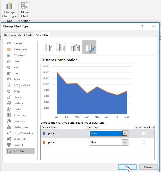
9- Go to "Design" tab, "Data" group and click on "Change Chart Type".
Go to "All Charts", select "Combo", and change the Chart Type to "Area" and "Line".
Press "OK".
10- Save the image below (Bitcoin Background) by right clicking the image and select "Save image as". You have the option to Download the complete file, and copy the image available inside.


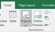
11- Go to "Insert" tab, "Illustrations" group, click in "Picture" and choose the images that you just saved.
12- Copy the picture that you have inserted; Select the area chart and paste the image.

13- Right-click the chart area and select "Format Chart Area".

13- Go to "Chart Options", "Fill", and select "Gradient fill".

14- Change the dark color to "Blue-Gray, Text 2, Darker 50%",

15- Select and remove the remaining colors.

16- Select the chart, go to "Chart Elements" and check "Data Labels".

17- Right-click the vertical axis and "delete".

18- Right-click the horizontal axis and select "Format Axis

19- Go to "Axis Options" and check "On tick marks".

20- Go to "Text Options" or change the color in the "Home" tab. pick the Black, Lighter 35%" to change the axis color.

21- Right-click the "Data Label", and go to "Format Data Labels".

22- Go to "Text Options", "Shadow", and select "Offset: Bottom Left". Also, go to "Label Options", and change the "Label Position" to "Above".

23- Change the color to "White" and size to 16.

24- Go to "Chart Elements" and check "Primary Major Horizontal" and "Primary Major Vertical".

25- Right click the gridline and go to "Major Gridline Options", and change the line to "Solid Line", color to "light-gray", and 90% of "Transparency". Do the same to both horizontal and vertical gridline.

26- Double click the title, and type "The Bitcoin journey in 2018 - USD.

27- Click and change the size of the "Plot Area" image below.

28- Right-click the "Line Chart", and select "Format Data Series".

29- Change the line to "Solid line", color to "Gold", and width to 4.5pt.

30- Go to "Effects", and select "Offset: Bottom Shadow".

31- Delete the remaining data labels in the area chart.

32- Congratulations! You have created and formatted your chart with a beautiful theme.
Extra: Check how it looks with no image. I know... still good, but the image is helpful to give context :)


If you want to learn more about using shapes and pictures to create visual content, try my book "Dynamic Infographic":

Join our Facebook group; and if you liked, why not share this article with your friends?


Comments